Tutarium guide
Change a book page layout and colour style
Preview seven layout approaches and six colour styles, then publish a combination that suits the book and its campaign.
Why this matters
The best layout makes the next reader decision obvious. A review-led book may need social proof early; a launch may need a stronger buy path; literary fiction may benefit from a quieter editorial treatment.
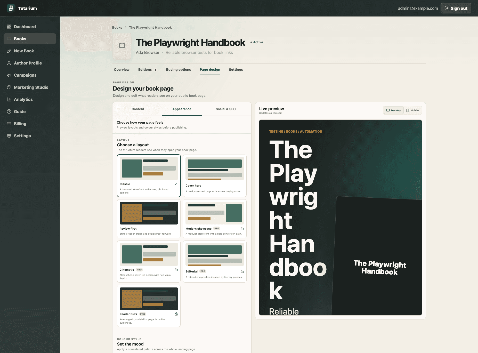
Open Page design and choose Appearance
From the book workspace, choose Page design, then Appearance. Layout choices change the page structure; colour styles change its palette. Neither choice changes the book URL or buying destinations.
Choose a layout for the book’s strongest evidence
Classic is balanced, Cover hero leads with artwork, and Review first moves praise forward. Pro adds Modern showcase, Cinematic, Editorial, and Reader buzz for more distinctive launch, atmospheric, literary, or social-first presentations.
Set the mood with colour
Warm, Dark, and Blue cover the core palette choices. Pro also includes Midnight noir, Neon romance, and Botanical. Treat the palette as support for the cover—not a reason to reduce readability.
Preview desktop and phone views
Switch the preview between desktop and mobile. Check title wrapping, cover contrast, the first buying action, edition labels, and long descriptions before saving.
Understand Pro previews
You can preview a Pro layout or colour style on a free account, but you need Pro to save it. Your current published design stays unchanged until a valid choice is saved.
Save, then view the real page
Save changes and open View page from the book workspace. Make a final check at the same screen size your readers are most likely to use.